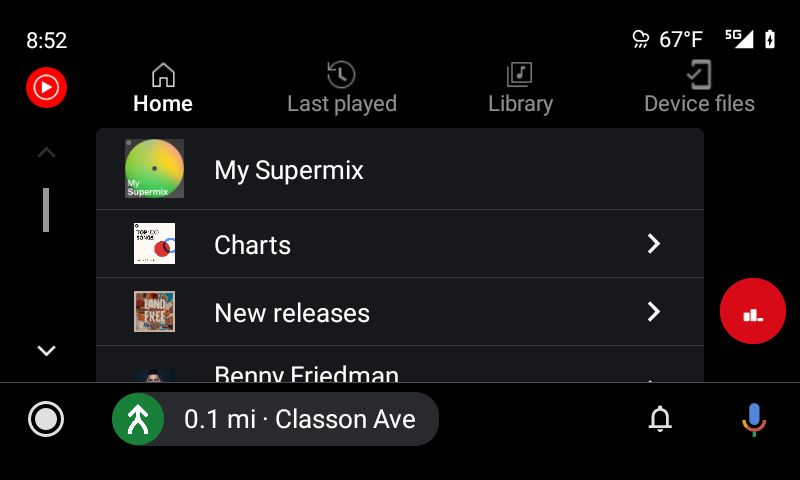
The YouTube Music app for Android Auto is getting a minor UI refresh that makes it more intuitive to use while driving. The updated design adds new tabs to the top of the app to let you easily access recently played songs, your library, and music on your device, along with a few other minor changes.
According to Android Police, the updated UI has already started rolling out to some users. As you can see in the attached screenshots, the new interface has ‘Home,’ ‘Last Played,’ and ‘Library’ tabs at the top for easier access. These tabs replace the app’s current main menu interface, which covered the entire screen. Along with these three tabs, YouTube Music for Android Auto has received an additional ‘Device files’ tab that gives you easy access to music files stored on your phone.


L: Old interface with the main menu; R: New interface with tabs
Since the new interface doesn’t require users to go back to the main menu to access the options mentioned above, it no longer has a back button. Instead, it now features a YouTube Music icon in the same location. Other than these changes, the rest of the interface remains relatively the same. It still shows the scroll bar to the left of the songs, albums, and playlists, and album art is still displayed in rows of three. Even though the new interface isn’t all that different, it should offer users a faster and safer experience while driving.


L: Old interface with back button; R: New interface with YouTube Music icon
The updated YouTube Music interface on Android Auto is reportedly rolling out with v4.30.50 of the app, and you can download it by following the Play Store link below. If it isn’t available on the Play Store in your region yet, you can download the latest APK from APK Mirror by following this link.
YouTube Music (Free, Google Play) →
The post YouTube Music for Android Auto gets a minor UI refresh appeared first on xda-developers.
from xda-developers https://ift.tt/3cnuSqh
via IFTTT

No comments:
Post a Comment